By Lawrence G. McMillan
This article was originally published in The Option Strategist Newsletter Volume 21, No. 20 on October 26, 2012.
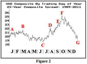
We occasionally publish charts showing the seasonal pattern of $VIX. Figure 2 below shows the composite price of $VIX for a 23-year history (1989 through 2011). This chart is constructed simply by following this method: gather the 23 $VIX prices for the first trading day of the year, sum them, divide by 23, and that is the first point to plot on the left of the graph. Continue that way throughout the year.

It is not too surprising to note that volatility bottoms out on July 1. The remainder of the year may be a bit surprising, though: first, volatility begins to climb right away during July and August, eventually peaking in midOctober. Then it falls dramatically during the fall of the year, eventually ending the year not much above the July lows. Of course, any one year can deviate from this pattern, but over the 23-year history, this is the “average” movement of $VXO (the “old” VIX) during the year.

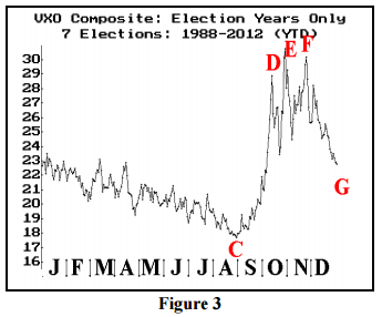
In election years, the composite picture of volatility changes a bit, but not tremendously. Of course, now we only have 7 years (including this year) of data to work with. Now, the vol low is about September 1st, and volatility remains high longer — into Thanksgiving – before finally declining somewhat in December.
This article was originally published in The Option Strategist Newsletter Volume 21, No. 20 on October 26, 2012.
© 2023 The Option Strategist | McMillan Analysis Corporation

