
By Lawrence G. McMillan
Some traders prefer to see columns of numbers, and others—myself included—prefer to look at graphs or charts. A “profit graph” is a graph of the potential profits and losses from a position. With options, it is possible to describe most of the major strategies by the shape of their profit graphs. A simple example should be sufficient to demonstrate the concept.
Example: Suppose that XYZ common stock is trading at 50, and the XYZ July 50 call is selling for 3, or $300. The profit table shown here details the potential profits and losses at various XYZ prices at July expiration. The same information is shown in the profit graph. The image below, which shows that this position has a limited loss on the downside and can make theoretically unlimited profits on the upside.
Stock Net Price Call Price Net Result ($)
40 0 -300
45 0 -300
50 0 -300
53 3 0
55 5 +200
60 10 +700
70 20 +1700
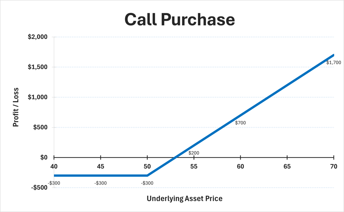
A quick look at the graph is all that is needed to understand the nature of this strategy. When the graph is labeled with the dollar amounts of risk and profit, and the break-even point, then we have a specific graph of this particular call option purchase. Thus, the profit graph can be generic or specific, depending on whether or not the axes are significant profit and loss points.
© 2023 The Option Strategist | McMillan Analysis Corporation