
By Lawrence G. McMillan
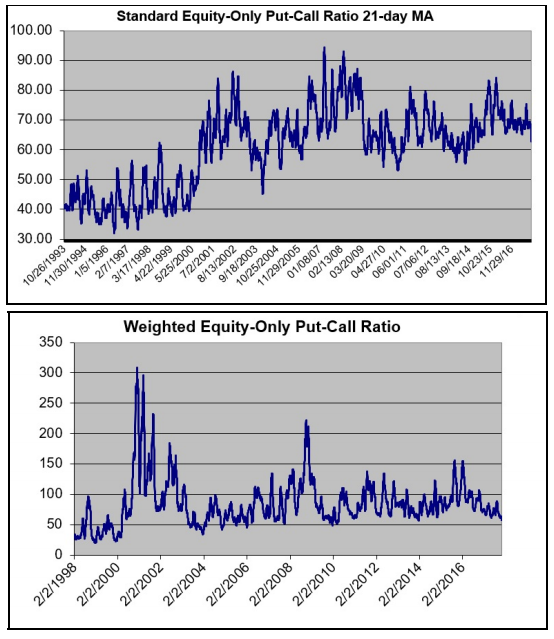
We have been repeatedly noting that the equity-only put-call ratio charts are at multi-year lows. The charts on the right show visual evidence of this.
These are very long-term put-call ratio charts, extending back 25 years in the case of the standard ratio (upper chart) and 20 years in the case of the weighted ratio (lower chart).
If you look closely at the right-hand side of the charts, you will see that current levels are as low as they were in 2014. But does that have any real predictive meaning, other than to say the ratios are “overbought?” Not really. In 2014, after registering low extremes on the put-call ratios in January, there was a sharp correction of about 9% in $SPX in less than a month. Then prices rose strongly thereafter for a few months...
Read the full article by subscribing to The Option Strategist Newsletter.

© 2023 The Option Strategist | McMillan Analysis Corporation