
By Lawrence G. McMillan
Breadth is the difference between advancing issues and declining issues, usually measured on a daily basis. Since the major averages only reflect what has happened to a few of the more important stocks (500 stocks in the Standard & Poors 500 Index – $SPX – for example, or 30 stocks in the Dow Jones Industrial Average), technicians have long used breadth as a measure of the health of the overall stock market. Breadth – or more accurately, cumulative breadth – is one of the four major indicators that we use to forecast the markets. Cumulative breadth is merely the running total of daily breadth figures.
If cumulative breadth deviates from the path of the stock market itself, it can be an early warning sign of a market move. Cumulative breadth represents what is happening to all of the stocks, not just the few that are in the major index, such as $SPX or $INDU (Dow Industrials).
We wrote about this indicator in some length in Volume 23, Nos. 14 and 16. The reason we are writing about this again is twofold. First, there is an even larger discrepancy between breadth and the market than before. Second, I was recently alerted to a similar indicator – cumulative volume breadth – that I thought to be worth investigating.
“Normal” Cumulative Breadth
Let’s start by reviewing the cumulative breadth articles that we published before. Then we’ll look at updated versions of the same charts that we have looked at in the past.
NYSE cumulative breadth is not useable because it has a lot of preferreds and other interest-rate-related issues that distort NYSE breadth. This has been the case since decimalization was introduced back in 2000-2001. Fortunately, we keep “stocks only” data, using all optionable stocks. We keep advances and declines, advancing and declining volume, put-call ratios, and so forth, using only this data. In this manner, we are able to see the technical indicators as they relate solely to stocks.
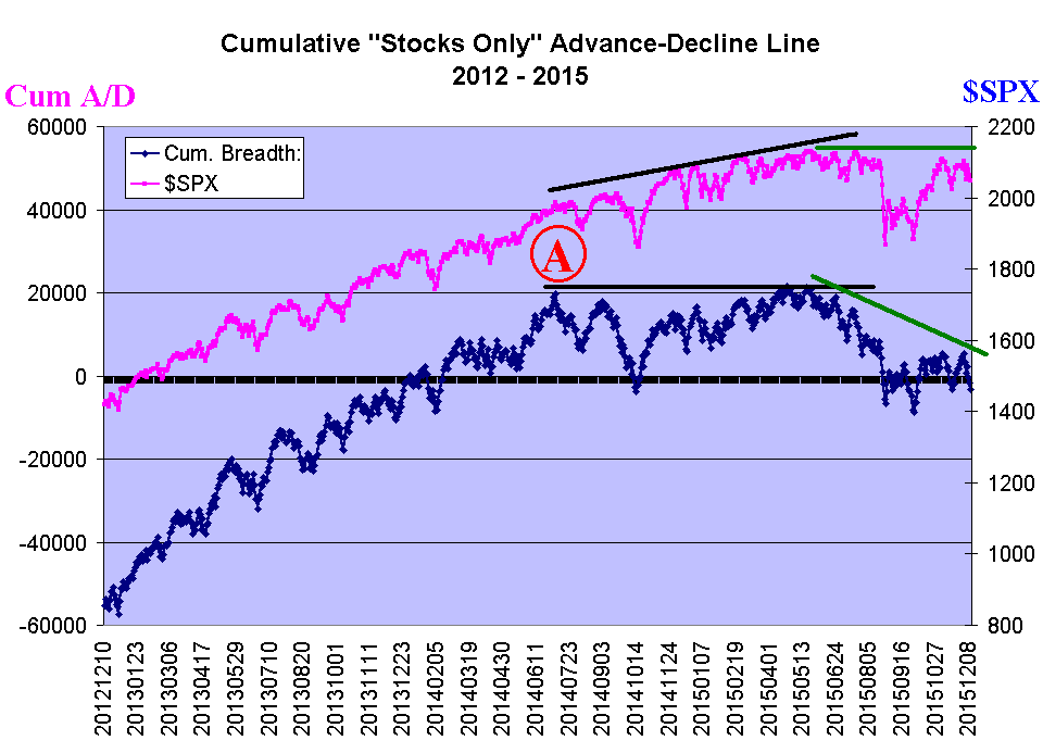
Figure 1
Figure 1 shows the up-to-date chart of “stocks only” cumulative breadth, from early 2012 to the present. The upper, pink line is the $SPX Index. The lower line is cumulative breadth, using our “stocks only” data.
On the left half of the chart, everything was bullishly delightful. Both $SPX and cumulative breadth were making new all-time highs, pretty much simultaneously. But since early July, 2014, a negative divergence has been growing. The solid black lines – which extend from July 2014 to June 2015 – show the first period of divergence, wherein the stock market kept making new all-time highs, but cumulative breadth did not.
Eventually that resulted in the sharp pullback last August. I think many market observers thought that the sharp pullback in August would clear out the excesses and pave the way for another round of higher stock prices ahead. But that hasn’t happened. Yes, the market has recovered, but breadth has not. In fact, the period since last summer until now has seen $SPX recover to nearly its all-time highs, but cumulative breadth has fallen off woefully. This is another, and more timely, warning sign that all is not right with the market.
You might rightfully ask when it is time to sell when divergences such as these appear. As we noted in those previous articles on breadth (in which there were some examples of a negative breadth divergence lasting for a long, long time), one cannot use this as a timing indicator. However, when a negative breadth divergence exists, one should not ignore any major market sell signals from his indicators.
For example, there has been a “modified Bollinger Band” sell signal in effect since early November (see $SPX chart, page 11). One might rightfully couple that with the evidence of a negative breadth divergence, as reason for maintaining a short market position or for owning protection for his portfolio – in the form of index puts or volatility calls.
Cumulative Advancing and Declining Volume
As a means of countering some of the aspects of NYSE and NASDAQ breadth not “working” because of the somewhat odd makeup of the stocks in those data sets, some technicians use Volume for their cumulative breadth analysis.
"When a negative breadth divergence exists, one should not ignore any major market sell signals from his indicators.
The idea is the same. Each day, subtract declining volume from advancing volume, to get the daily Volume breadth. Then keep a running total of that, in order to compute the Cumulative Volume Breadth.
Using volume, we don’t really have to worry much about the non-stocks that trade on the NYSE, for they don’t trade with much volume. Similarly, for the NASDAQ composite, the tiny stocks that affect the advance-decline line don’t trade much volume, so they don’t have as much affect on the cumulative volume breadth line.
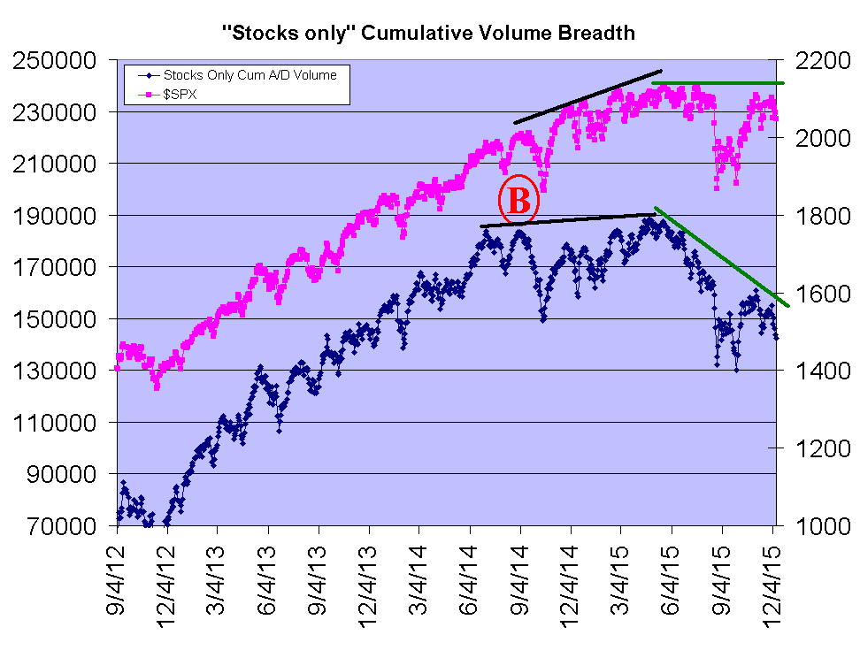
Figure 2
Figure 2 shows the “Stocks only” Cumulative Volume breadth line, on the same chart as $SPX. Point “B” on the chart is approximately where both cumulative volume and $SPX made simultaneous new all-time highs. Note that came several months after point “A” in Figure 1. From there, cumulative volume breadth fell off, but did manage to make marginal new highs this past May (2015). But since then, there has been a very negative divergence between the two lines. Cumulative volume breadth has fallen off sharply, while $SPX is still near its all-time highs. So, in the final analysis, Figure 2 agrees with Figure 1: there is a negative divergence lingering, and that will eventually lead to major selloff.
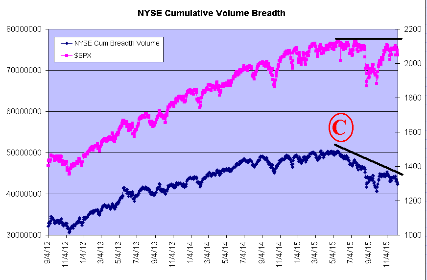
Figure 3
Figure 3 shows the Cumulative volume breadth line for NYSE data. Note that this chart is quite similar to Figures 1 and 2 – indicating that the problems of including the interest-rate-related stocks and other “non-stocks” is not a problem any longer. On this chart, point “C” marks the simultaneous all-time highs in cumulative volume breadth and $SPX. Since then, there has arisen a very obvious negative divergence, just as we saw on the previous two charts.
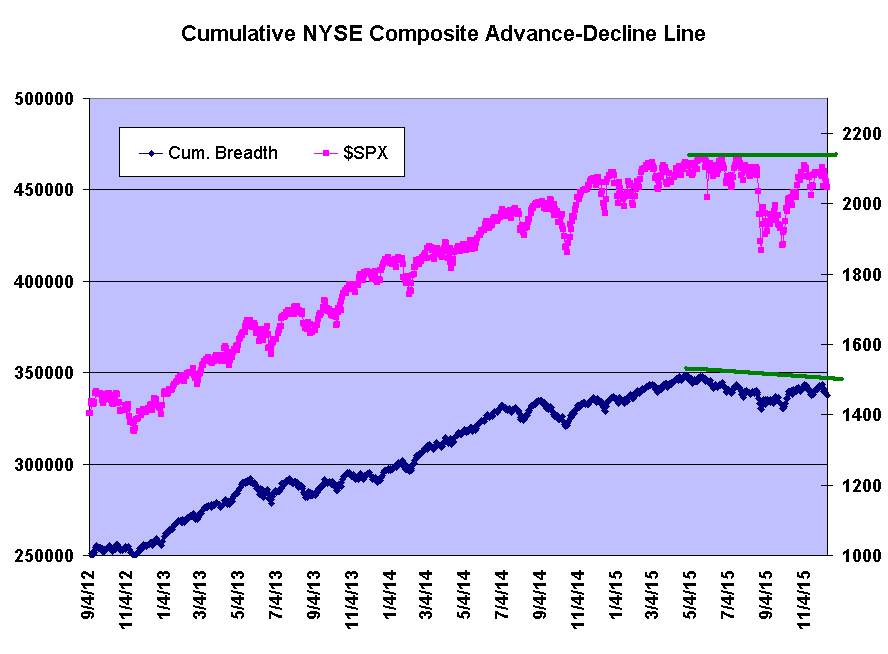
Figure 4
For completeness’ sake, I have included Figure 4, which shows the raw NYSE cumulative advance-decline chart. Note the contrast with Figure 3 – the NYSE cumulative volume chart. Figure 4 shows only a very minor divergence at best, because it includes all of the “non-stocks,” and they generally have been advancing for some time now (as most interest-rate investments have). Figure 4 is not useful for analyzing the stock market, because of this distortion.
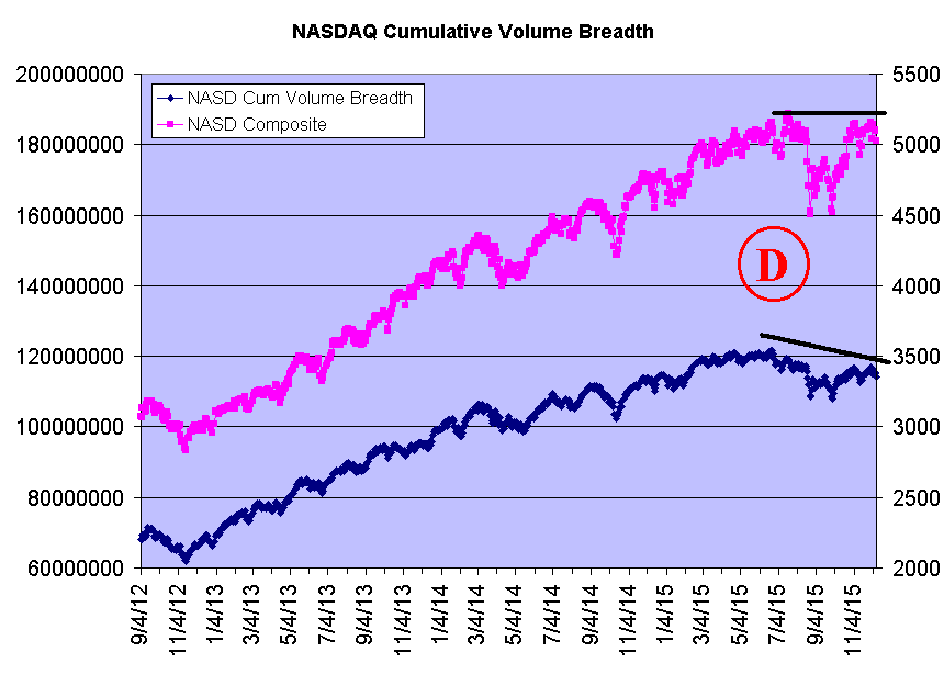
Figure 5
The final chart (Figure 5) shows the same data for the NASDAQ Composite Index (not the NASDAQ-100, but the entire set of NASDAQ stocks). This chart is similar, in that the Index and the cumulative volume breadth lines both made all-time highs at point D – in July, 2015. Since then, there has been a negative divergence, but it isn’t quite as stark as it is in Figure 1 through 3.
In any case, the four charts in Figure 1, 2, 3, and 5 are all telling us the same thing: the participation in this market is lagging, and it is especially obvious in the cumulative volume charts. Since it is generally impossible to tell how long a negative divergence can exist before the market finally cracks, we cannot use this information as a timing indicator. However, we do have plenty of other indicators at our disposal. When one of those gives a major, intermediate-term sell signal, it should never be ignored while these divergences exist. At the current time, the equity-only put-call ratios are on sell signals, as is breadth, and (although rather stale) the “modified Bollinger Band” system is on a sell signal.
On last week’s Hotline, we closed down all of our speculative positions in SPY, but we want to add a put position here – to be held while any of the major indicator sell signals are intact and while the breadth charts are showing this negative divergence.
For the trading recommendations based on this article (originally published on 12/11/15), subscribe to The Option Strategist Newsleter.
1. Prior to decimalization, the minimum tick was an eighth of a point. A preferrred stock or other interest-rate-related issue would not normally move that far (12.5 cents) on a given day. Hence, they didn’t have much effect on market breadth. However, since decimalization, these issues can move a penny, and thus they are then counted in advances and declines. It should also be noted (and was noted in those previous articles) that NASDAQ cumulative breadth doesn’t seem to be a very good indicator either, for it is often flat or negative for years, even while NASDAQ stocks are rallying. This is most likely due to the fact that there are just a lot of small, “dog” stocks in the NASDAQ composite breadth index© 2023 The Option Strategist | McMillan Analysis Corporation

