
It’s that time of the year when reviews and forecasts are prevalent. As most of our subscribers know, for our purposes this is an exercise in theory more than practice, for we don’t take positions that last an entire year or longer. In fact, our longest positions are perhaps three months at most – straddle buys, Total put-call ratio buy signals, or other such positions of intermediate-term length.
In this article, we’ll first review 2012 in terms of what we forecast – and how it might apply to this coming year, if at all. Also, we’ll look at what types of signals worked best, although the actual review of our specific recommendations will not be published until the next issue (Volume 22, No. 1).
Review of 2012
Last year, I laid out two scenarios for 2012. The primary one had the market entering a bear market in the last half of the year 2012. That was based on similarities to the 1937 to 1942 market period. That, of course, did not occur. Even though the Fed is pursuing similar activities to those of 70-some years ago (heavily purchasing government debt to force investors into riskier assets) and the economy is about the same (low growth, naggingly high unemployment, etc.), the stock market’s reaction was completely different.
The failure of the primary scenario thus invoked the second one that was proposed. In that scenario, parallels were drawn to the 1962-1974 time frame. Again, a bear market lies in the future, but only after higher highs were made in 2012. That occurred in late summer. We will expand on this second scenario later in this article, for it is still a possible roadmap of the future.
It can sometimes be useful to see how the major indicators performed during the year.
Equity-Only Put-Call Ratio
The put-call ratio charts did a good job this year of calling major turning points. Refer to the graphs at the top of page 6 to observe that, in 2012, there were put-call ratio sell signals in March (a little early) and April (well-timed), followed by an excellent buy signal in early June, sell signals in September near the year highs, and a buy signal near the November bottom. Another sell signal may be setting up now (see page 5). Thus these ratios continue to be some of the best indicators available.
Total Put-Call Ratio
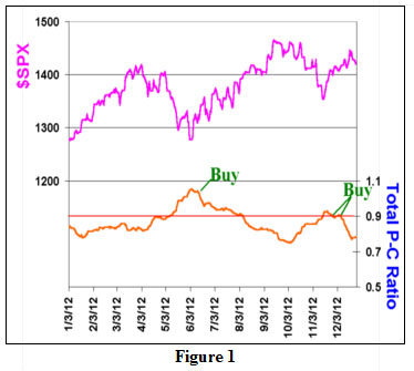
The Total put-call ratio’s chart for 2012 is shown in Figure 1. The ratio gave a buy signal in mid-June, when it rolled over from a peak that was formed above the 0.90 level. Its 100-point target for $SPX was later fulfilled. The Total ratio gave a second buy signal recently, and so that does make us feel that a further rally in the first half of 2013 is still possible.
Composite Implied Volatility
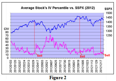
Volatility has been relatively low for most of the year. This was in evidence as much as anywhere in the Composite Implied Volatility data that we watch. One way we look at this data is to observe the composite implied volatility of the average stock’s options. When that falls below the 10th percentile and then later rises above the 16th percentile, a sell signal is generated. In 2012, three such signals were generated (see Figure 2). The first two were excellent sell signals – especially considering that 2012 was basically a bull market year. A third sell signal was generated recently, but it was a bit premature. It is still in effect. There were no buy signals from CIV in 2012. That is a bit unusual, but CIV buy signals are only issued if the average stock’s option CIV rises above the 90th percentile. The highest level that was attained in 2012 was just above the 70th percentile, near the early June stock market lows. Overall, this indicator was quite useful in 2012.
Breadth Oscillators
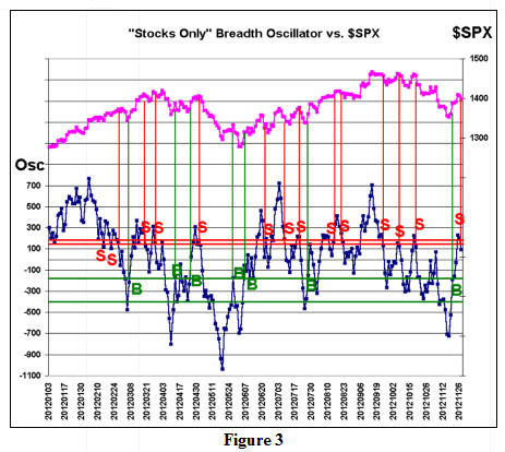
Figure 3 is an interesting chart that we really haven’t published before – or if we have, it’s been a long, long time. It shows the “stocks only” breadth oscillator signals for the year 2012. There are quite a few of these, and usually we don’t adhere to them unless they are accompanied by another technical indicator market signal in the same direction. But in Figure 3, we just show the raw breadth signals. A buy signal is generated when the “stocks only” breadth oscillator falls below –400 and then later rises above –180. At that point, a buy signal occurs. It would be stopped out if the oscillator fell back below –400 again. Stop outs are not shown in Figure 3.
A “stocks only” breadth oscillator sell signal occurs when the oscillator rises above +140 and then subsequently falls below +120. It would be stopped out on a rise back above +140. Again, such stops are not shown in the chart on the right (Figure 3).
To aid one in seeing where the signals occurred, the $SPX chart (upper, pink line) is included above the “stocks only” oscillator chart. Moreover, the signals are denoted by drawing a vertical line from the signal’s inception up to the $SPX chart. You can see that most of the red vertical lines are at relative high points on the $SPX chart and most of the green vertical lines are at relative lows. Thus, the oscillator signals are generally pretty accurate.
As an aside, note that it is not sufficient to just say the “market is overbought.” For example, look at the cases when the oscillator rose above +700. The first time (in February), the stock market continued higher; the second time (in July), the market had a modest pullback; and the third time (in September), the market eventually had a major correction.
Daily Sentiment Index:
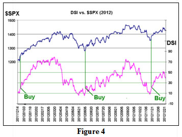
Refer to Figure 4. For the S&P 500 futures, the DSI buy signal on Dec 22, 2011 was excellent; the buy signal on June 8th was just as good; and the buy signal on November 20th modestly good. Ironically, even though S&P has been up for most of the year, there has never been a high DSI reading in 2012 above 90% bulls, which would indicate over-optimism.
Others
Without the benefit of a chart, these are some of the other indicators that we follow, including how they did in 2012.
Frequency of 90% Days: this indicator has given only one signal this year – a sell signal issued on November 23rd. That signal is unresolved so far.
The Seasonality of Volatility: this is a not a stock market prediction, per se, since it pertains to $VIX and not $SPX. But the “typical” volatility seasonal pattern is for the low to occur in mid-summer and the high to occur in October. That was not the case in 2012. For the most part, volatility was suppressed (below 21) for most of 2012. The high occurred on about June 1st, and there was no appreciable rise in $VIX during the fall of the year.
Election Year Predictions: 2012 was the fourth year of the Presidential Cycle, and the stock market rose as it usually does. However, election years are generally more volatile than normal – especially late in the year. That was not the case in 2012.
In summary, our indicators worked well in 2012, which was far more important than our long-term prediction.
Read the entire "2012 Market Review & 2013 Forecast" article ( published on 12/28/12) by subscribing to The Option Strategist Newsletter.

© 2023 The Option Strategist | McMillan Analysis Corporation