By Lawrence G. McMillan
This article was originally published in The Option Strategist Newsletter Volume 12, No. 11 on June 12, 2003.
Admittedly, option traders’ “hot” topics may sometimes be pretty boring to the average guy, but this question (above) has been the subject of much discussion amongst all manner of stock market analysts. Recently, the various volatility averages began to rise, even while the broad stock market was rising. This is something that hasn’t happened for a few years, and it also seemed to go against the “conventional” (and I should mention, incorrect) volatility analyses that one is often subjected to when watching financial TV these days. So, just what does this rise in volatility mean, coming as it does during a period of rising prices? That’s what we’ll explore in the feature article in this issue.
For those not familiar with the correct interpretations of $VIX as a contrary indicator, let’s review them first. Then we’ll tackle the topic at hand. Almost every volatility analyst – from the old option pros to the newbie fundamentalists who just picked up on $VIX last summer (and, unfortunately, there’s a lot of the latter and not too many of the former) – knows that when $VIX spikes up to a peak during a period of severely bearish action, then a buy signal is at hand. If one considers how this comes about, he will see that it has a contrarian basis. The spike peak in $VIX is caused by panicky put buyers paying up for protection and – once they have purchased that protection at top dollar – the market turns and rises in true contrarian fashion.
The fact that everyone agrees on the contrarian interpretation of a $VIX buy signal does not mean that they agree on any other $VIX interpretations. Specifically, what does a low $VIX mean? Those who only look back three years or so will tell you that a low $VIX precedes a declining market. That is not true, when one considers a longer history (even assuming one knows what “low” is).

Other, more astute, $VIX analysts will tell you that when $VIX bottoms out and begins to rise, then the sell signal should be triggered. While this is a better interpretation than the previous one, it’s still not correct.
What is true is that a bottom on the $VIX chart precedes a market explosion. If you think of this as a contrarian, you will see that it must be true. What does a low $VIX mean? It means that sellers of options are aggressive, that buyers of options are timid, and therefore options are “cheap.” In fact, these option traders don’t expect the market to do much in the forthcoming days or weeks – that’s why they let the air out of the options, making $VIX very low. A contrarian knows what happens when a consensus is reached – the opposite! Well, what is the opposite of “...don’t expect the market to do much?” It’s a market explosion, of course. And the fact is, that market explosion can occur in either direction. In the last few years, since we’ve been in a bear market, those explosions have come on the downside. But back in the 1990's, during the bull market, such explosions often came on the upside.
Therefore, to say that a low $VIX is bearish, is wrong. Understanding that will separate you from most of the $VIX pretender-analysts out there.

Examples
Over the years, we have shown many charts depicting these $VIX movements, but a couple of them will be used here to illustrate our points that were stated above.
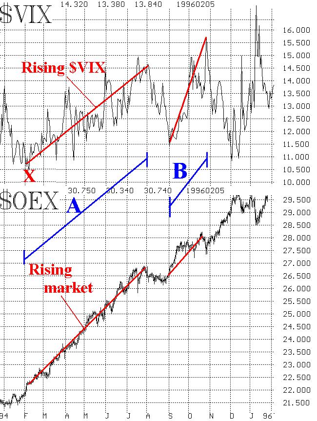
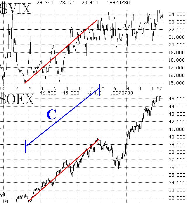
Consider the two charts above. In each, $VIX is graphed above $OEX, so that one can directly compare volatility and price movement. They happen to be from the 1995-1996 time period, but there are many other similar ones that could be shown from 1995-1999. On each graph, a red line shows the rising portions of the $VIX and $OEX charts to be observed. The blue line is just a marking to show where both measures were rising together.
The top graph shows two occasions where $VIX rose substantially while $OEX did the same. The first one – marked “A,” beginning around February 1, 1995 – is perhaps the clearest case of the decade. $OEX rose about 20% over a six-month period, and $VIX rose about 30%.
A shorter period of simultaneously rising $VIX and $OEX began later in 1995 – in September and October. That instance is marked as line “B” on the top chart.
Finally, the lower chart shows yet another occurrence – this one in 1996, marked as “C” – where once again $OEX and $VIX rose together for about six months. $VIX was a little more erratic in that period, but it still rose about 50% while $OEX gained 25% or so.

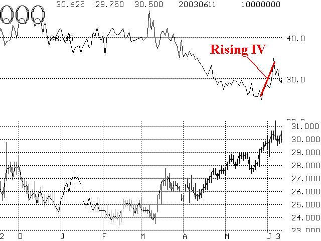
This discussion is pertinent because several of the volatility measures recently rose while the market rose as well. Those who have only studied the recent history of $VIX were confused by the fact that $VIX (or $QQV or $VXN) was rising while their respective indices were also rising. QQQ is shown on the right. $OEX is shown in the insert. In neither case is the rise in volatility of the magnitude as those shown on page 2, but everything has to start somewhere.
It’s entirely possible that the current bullish environment will continue and volatility will fall – making all this consternation I’m hearing regarding rising $VIX and $OEX a moot point. But if it should persist, you – our readers – will know that it’s just a function of the market becoming more volatile to the upside and not necessarily a bearish sign at all.
This article was originally published in The Option Strategist Newsletter Volume 12, No. 11 on June 12, 2003.
© 2023 The Option Strategist | McMillan Analysis Corporation

