
By Lawrence G. McMillan
This article was originally published in The Option Strategist Newsletter Volume 10, No. 11 on June 14, 2001.
In looking back over past issues, it is apparent that intermarket spreads have not been discussed in nearly a year. While this is not a subject that we discuss in every issue, that is too long of a time to go without addressing it. Consequently, in this issue, we’re going to take a look at the “standard” intermarket spreads that we have followed in the past. In addition, there is another interesting relationship that has arisen over the past year as the stock market has changed from a bull market to ... well, whatever this is.
Crude Oil versus Oil Stocks
One interesting relationship is that between Crude Oil and the stock prices of the major oil stocks. Crude Oil, of course, can be tracked with the futures prices. The major oil stocks can be tracked with one of several sector indices. We prefer to use the AMEX Oil & Gas Index ($XOI). The chart at the top of page two compares these two entities: continuous crude oil futures and $XOI. It extends back about seven years, so that you can get a very good feel for how current levels relate to past prices.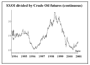
The Crude Oil futures use the continuous futures chart, for it gives the best “look” at how a strategy or system would have performed in the past. For those not familiar with continuous charts, it is merely the piecing together of the price action of the current short-term Crude Oil futures contracts over time. Rather than include the gaps that exist between each futures price month, those gaps are removed. In essence, a continuous futures chart tracks the profit and loss that would theoretically exist if a trader continuously held a long position in the nearest contract month at all times. When such a theoretical trader rolls his position from one month to the next, that gap is not part of his profit and loss. Hence the gap is not part of a continuous futures chart, either.
At the top of the chart, oil stocks are outperforming oil futures by a substantial amount; at the bottom of the chart, crude oil is outperforming oil stocks. Looking at the chart above, you can see that there are two very large moves – essentially a round trip from the bottom of the chart in 1996 to a high in 1998 and then back to the bottom again at the end of 2000. The scaling on the chart is somewhat irrelevant, for prices on a continuous futures chart do not correspond to any real prices. However, the chart is useful for the timing of relationships.
From this chart alone, it would be premature to say that there is some sort of 2-year cycle in existence. In fact, there’s probably not – considering that the prices on the left side of the chart (in 1994 and 1995) were more or less flat in the middle of the chart. However, what I believe we can say is that the ratio of oil stocks to oil futures was near a significant low at about the beginning of this year. That is, oil itself had been doing much better than oil stocks for a long time (two years). Now that process appears to have reversed: after seeing oil outperform oil stocks for two years, we have embarked on a period of time where oil stocks are doing better. There still appears room for more improvement by stocks, too, for the line is still low on the chart at current prices.
Strategy
The strategy that we prefer to use in these situations is to buy in-the-money options. This gives you two ways to make money: 1) the spread moves in the direction you want it to, or 2) prices move a great deal in either direction. Certainly the first way to make money is obvious – for example, if we bought calls on $XOI and bought puts on Crude Oil futures, and the $XOI outperformed Crude Oil, we would make money. However, even if $XOI does not outperform Crude Oil, our strategy still gives us a chance to make money – as long as prices move by a good distance. For example, suppose that oil stocks fall ($XOI drops in price) and at the same time Crude Oil loses value too. Even if the spread between the two doesn’t widen out as we thought it would, we might still make money. That’s because the calls on $XOI can only lose a fixed amount, while the puts on Crude Oil can continue to generate profits as long as prices fall.
We’d like to make a recommendation for this spread, but due to the nature of the actual derivatives that are available, this would be both a rather complicated recommendation and an expensive one. Therefore, I’ll explain it, but we’re not officially recommending it.
When one trades two markets in an intermarket spread, he needs to calculate the correct quantity to trade. The following formula does the job: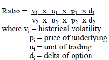
Making this calculation for $XOI and Nov Crude Oil, the respective numbers are: volatility (0.19 and 0.25), price (583.83 and 28.48), and unit of trading (100 and 1000). Let’s assume for the moment that the deltas of any two inthe- money options we’d buy would be about equal. Putting $XOI in the numerator of the fraction, the ratio turns out to be 1.56. That means we should buy 3 Crude Oil puts for every two XOI calls we buy. Since these are in-themoney options, this position would probably cost nearly $20,000 to establish – too much for the size of positions that we normally recommend. If this fits in with your personal account size, though, you could consider buying 2 XOI Oct 570 calls and buying 3 Nov CL 32.0 puts. The risk would theoretically be the entire premium since it is possible for the two markets to diverge substantially.
Note: if one were to substitute the CBOE’s Oil Index ($OIX), which trades at about 340, for $XOI, the ratio formula would drop to something near 1.0 – in which case one OIX Dec 320 call and one Nov CL 32.0 put would require a combined cost of about $8000. However, both are very illiquid, so we just decided to go onto another spread, rather than try to fashion a “Rube Goldberg” sort of spread.
Gold vs. Gold Futures
Another intermarket spread that we sometimes follow is that between Gold stocks (as represented by the PHLX’s Gold and Silver Index, $XAU) and the price of Gold futures. The chart below shows this relationship over the past seven years.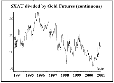
You can see that this graph has generally been trending down since 1995 – indicating that gold stocks have been underperforming the price of gold for all that time. However, beginning late in the year 2000, gold stocks have tried to turn things around – and the ratio is now back towards the center of the chart. I don’t really see this ratio as “extreme” at the current time.
Utility Stocks vs. Bond Prices
The ratio between utility stocks and bond (futures) prices is another one that has led to trading opportunities in the past. As you might suspect, this ratio is now tilted heavily in favor of the Utility Stocks (as represented by the PHLX’s Utility Index, $UTY). This is due, in large part, to the energy crisis in California. Utility stocks have reaped large profits there, separating the fortunes of the companies from the mundane world of interest rates. But is this a permanent change, or an opportunity to establish a hedged position at a favorable spot on the chart?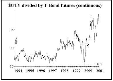
If one were to use options on the $UTY Index and options on December Crude Oil, we’d run into the same problem as with the oil spread – too expensive and quite illiquid. However, in this case, we have some lower-priced products that behave just like $UTY and T-Bonds. The Utility HOLDRS (UTH) sell for less than a third of the price of $UTY, and the CBOE’s 30-Year Rate Index ($TYX) has much cheaper options than T-bond futures. The ratio can be computed using these values for UTH and $TYX, respectively: volatility (0.23 and 0.14) and price (111.6 and 56.45). The ratio turns out to be 3.25, meaning that we need to buy 3 $TYX options for each UTH option. Since $TYX is a rate index, it goes up when T-Bond prices go down. Hence we need to buy puts on both UTH and $TYX. Such a position would produce results similar to buying puts on $UTY and calls on T-bond futures, which is our intent since our initial supposition was that Utility Stocks are “ahead” of T-Bonds.
  Position I208: Utilities Intermarket Spread
    Buy 3 TYX Dec 60 puts (TYX XL)
   and Buy 1 UTH Dec 115 put (UTH WC)
     for a total debit of $2400 or less
$TYX: 56.54              TYX Dec 60 put: 4.10
UTH: 108.75            UTH Dec 115 put: 10.40
The entire $2400 is theoretically at risk. That could happen, for example, if interest rates rose, but utility stocks traded higher anyway – perhaps buoyed by profits from energy sales in California. However, if the historic relationship between utilities and T-Bonds reasserts itself, then the spread should shrink.
Value vs. Growth
Finally, we’ve recently been monitoring a new spread. A long-term subscriber suggested taking a look at the relationship between value stocks and growth stocks. There are Russell Indices in both categories (Russell 1000 Growth: $RLG, Russell 1000 Value: $RLV; Russell 2000 Growth: $RUO, and Russell 2000 Growth: $RUJ). In addition, there are iShares on the Russell 2000 components, and those iShares have listed options. So, if we find a spread that is viable, it can be traded.
The chart at the top of page 4 shows the long-term relationship between value and growth stocks. You can see that for nearly that entire time, growth and value drifted back and forth in a well-defined trading range. Then, in 1999, when the internet bubble really began to inflate, growth stocks began to dominate. That dominance continued on into the early part of 2000 when the peak on the chart was reached. So far, none of this should be too surprising to anyone who has been paying attention to the stock market over the past few years.
However, what happened next might come as a surprise. Once the internet bubble burst, growth stocks came crashing down – and at the same time value stocks suddenly came into great favor. As a result, the relationship between the two sectors underwent a massive transformation. Not only did the ratio return to its former range, but it went plummeting below it – crashing to a point just as far below the norm as it had previously been above the norm.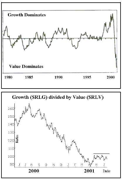
The chart on the top is not an actual chart of the relationship of the two indices, since they did not exist over that entire time. But it is a good representation, based on data from the Frank Russell Company. However, the lower chart on the right is an actual price chart – encompassing the time period since these indices were broadcast to the public, starting in May, 2000. This lower chart relates directly to the wild action on the right-hand side of the upper chart.
The indicated strategy at this juncture – if you thought that growth vs. value would return to a higher point on the chart, would be to buy growth and sell value. In some ways, this lower chart looks almost like a recent chart of the broad stock market: there was a long decline during 2000, followed by a tentative bottom in April, and a modest rally since. That might give one some pause about establishing long growth/short value positions at the current time (since we are negative on the broad market).
However, if one were to “play” this spread, he should use these iShares: IWO (growth) and IWN (value). The proper strategy would be to buy in-the-money calls on IWO and in-the-money puts on IWN. We will keep an eye on this spread and perhaps utilize it when the next buy signals arise from our indicators. However, if it were to rise above the line drawn on the lower chart, then that could be considered a “breakout” and positions could be established at that time.
This article was originally published in The Option Strategist Newsletter Volume 10, No. 11 on June 14, 2001.

© 2023 The Option Strategist | McMillan Analysis Corporation