
By Lawrence G. McMillan
This article was originally published in The Option Strategist Newsletter Volume 10, No. 16 on August 23, 2001.
Almost every day, some technician is quoted as saying that market breadth is strong – and, by inference, that there is an underlying positive tone to this market. The indicator that is often used to demonstrate this is the advance-decline (A-D) line – the daily difference between advancing and declining NYSE issues. Of course, we see the same figures. There have been more advances than declines on quite a few days in the last year or so – especially the last eight months. Yet the market continues to struggle. So where is all this supposedly positive action?
Some observers have been quoted as saying that the problem is just with the big-cap indices – that the positive A-D figures indicate that the small stocks are doing well. But this isn’t true. Even the small-cap indices are doing poorly. The Russell 2000 Index ($RUT) is down 50 points (10%) since its May top. The Value Line Index ($VLE) has declined by a similar amount. The strongest smallcap index, the Small Cap Index ($SML), has been going sideways in an evertightening range for three months. So, if there is supposedly such great breadth on the NYSE, where is it going?
The answer is that the NYSE A-D figures, while technically correct, are extremely misleading. Richard Russell (Dow Theory Letters, P. O. Box 1759, La Jolla, CA 92038) first pointed this out in a recent article. The problem lies in the fact that “approximately 48% of the NYSE issues are now preferreds, closed-end bond funds, closed-end stock funds, foreign stocks, ADRs and warrants.” Russell goes on to correctly point out that “one of the main arguments of the bulls is based on advancedecline figures, which are now almost useless and actually deceptive.” In fact, as we will see later, the problem extends to other important indicators as well.
Now, some of those “odd” securities that compose that 48% NYSE issues that are not actual operating companies still reflect market action – but many of them do not. So, we decided to create our own version of the A-D Line, using operating companies that trade options. That is, in our “stock” data base, we have mostly real companies. Sure, there are a few exchange-traded funds (SPY, DIA, QQQ), but very few.
The accompanying chart shows two lines – the usual NYSE A-D Line (the one that we are all familiar with) and one constructed by counting up the advances and declines amongst optionable stocks in our data base each day. The chart extends back a little over a year. In that time, the difference between the two lines is shocking. The NYSE A-D Line is clearly presenting a very false, positive picture. The “stocks only” line is presenting what is more truthful – a struggling market that is seeing most stocks trading lower.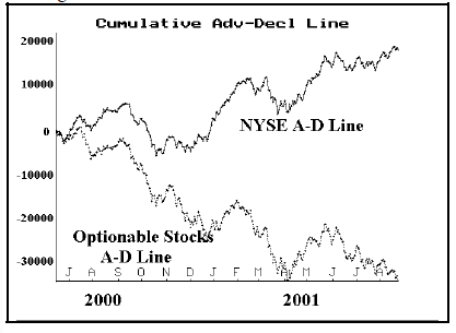
The Arms Index
These “non-stocks” that comprise the 48% of NYSE issues generally trade with very little volume. This has major ramifications for another well-known indicator, the Arms Index (or “TRIN”). Followers of TRIN have been talking about very oversold readings all year long and some have been using that as a means of justifying a long-term bullish opinion on the stock market.
For those not familiar with this indicator, the formula is:
On bearish days, the Arms Index is a high number, while on bullish days it registers a low number (because volume tends to dominate the issues themselves). There are various ways to keep track of the Arms – such as moving averages. One common way is to declare it “oversold” when the 10-day moving average is above 1.20, and “overbought” when the 10-day moving average is below 0.80. Longer moving averages are also kept by adherents of the Arms Index.
The highest readings in history came after the Crash of ‘87 when the 10-day average reached 2.10 and the 55-day reached 1.75. Another perspective is that during the very nasty decline in the fall of 1998, the 10-day average reached 2.00 and the 55-day reached 1.29. Other than the bottom of the 1974 bear market, these moving averages have never reached levels similar to those. Of course, those were all market bottoms, and the high TRIN readings were correctly interpreted as being very bullish for the market in general.
However, recently we have seen the 10-day Arms average reach 1.5 – but it came near the top of the market in June. Meanwhile the 55-day moving average has been above 1.2 for nearly two months and recently reached 1.3. These are extremely high numbers for that longer-term moving average. Such high numbers would normally be associated with a market that is crashing downward in a severe bear market. But that hasn’t been the case. In fact, the apparent failure of the Arms to “call” a bottom in recent weeks even led one analyst (Victor Neiderhoffer) to write a misinformed article bad-mouthing the indicator. When I see a trustworthy indicator receiving bad press, I figure that either 1) it is about to work big-time, or 2) something has gone awry with the data it is using.
In this case, it is the latter problem. Look at the equation at the top of the page. The number of advances over declines inflates the ratio, while the volume of advances over declines deflates it. They’re supposed to balance out. However, with the distorted A-D figures we’re getting these days, both fractions are often bigger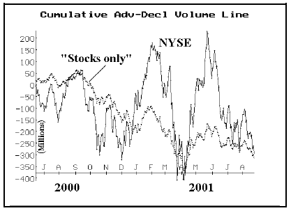
than 1.00! In other words, the 48% of “non-stocks” inflate the first fraction but they don’t trade much volume. Then, the “real” stocks – which are suffering and have more declining volume than advancing volume – inflate the second fraction. As a result, we are seeing the Arms Index at artificially high levels.
To verify that declining volume has been dominating advancing volume – no matter which way you look at it, observe the chart at the bottom of page 2. Both the NYSE and “Stocks only” lines are at the lower right side of the page – indicating heavy declining volume on balance.
Now, look at the chart below, which compares the Arms Index computed using the standard NYSE figures with the Arms Index computed using the “stocks only” data from our database. This graph uses the 20-day moving average of the Arms Index.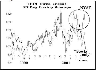
The circled area at the upper right of the graph shows the traditional Arms Index of late. One can see that it is quite a bit higher than the “stocks only” computation of the Arms Index. Hence, I contend that the many advisors who have been citing the high Arms Index readings as evidence of a long-term bull scenario are using flawed data.
McMillan Oscillator
Another indicator that we often use is, of course, our own oscillator. For those not familiar with it, our oscillator is computed as an exponential moving average:
Mnew = 0.9 x Mold + 0.1 x (NYSE advances – declines)
Thus, to get started calculating the oscillator, one only needs to know one value. Then all successive values can be computed by using the iterative formula above. Currently, the oscillator stands at 133.11 on Wednesday’s close, so that would be the variable Mold in the equation above. You would then use Thursday’s advances minus declines to compute the value Mnew (which would be Thursday’s oscillator value). Then, that value becomes Mold for Friday’s computation, and so forth.
Clearly, this indicator is also being influenced by the advance-decline figures. In general, it is higher than it “should” be, because of the inflated advance-decline figures. As you know, we have said the market is “overbought” several times lately. Looking back, that was probably because of these inflated advance-decline figures. However, at least that kept us on the bearish side of the market since the June top – a fortuitous stance.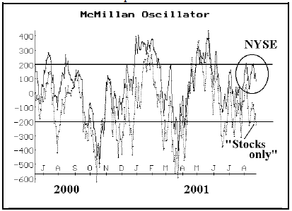
The inflated NYSE figures are circled on the upper righthand side of the chart. One can see that the NYSE oscillator is above +200 – our definition of overbought – while the “stocks only” oscillator is not. In fact, the “stocks only” oscillator is below –200, which is oversold! One can also see that this is the first time on the above chart that the two have been at such odds. At all previous times, even if the NYSE oscillator was slightly higher than the “stocks only”, they more or less agreed on buy and sell signals. Not now, though.
The “stocks only” oscillator would have given several buy signals during June and July – signals that more or less coincided with the major averages reaching the bottom of their respective trading ranges. While the market did not move considerably higher after any of those, it did bounce off the bottom of the trading range. The NYSE oscillator did not generate any of those buy signals.
Summary
The NYSE advance-decline figures are distorting many technical indicators. Does this necessarily mean that the market can’t rise? Of course the market could rise, but it is likely that the “rosy” pictures being presented by the advance-decline line and the Arms Index are, in fact, optimistically distorted.
Why do the “non-stocks” seem to go up more than they go down? That is, why don’t they exaggerate declining issues? I don’t know for sure (perhaps exchanged-traded funds are generally bought and not shorted), but the evidence is clear: be suspicious of the traditional advance-decline figures as long as this condition persists.
This article was originally published in The Option Strategist Newsletter Volume 10, No. 16 on August 23, 2001.

© 2023 The Option Strategist | McMillan Analysis Corporation