By Lawrence G. McMillan
This article was originally published in The Option Strategist Newsletter Volume 19, No. 12 on June 25, 2010.
Options have many uses, but a primary one is that they are built to be a hedge for many investors and traders – in order words, to take some uncertainty out of a particular trade or strategy. This is a well-known fact for professional traders, but less so for the novice option trader or – even worse – the investor who doesn’t use options because he considers them to be strictly a speculative vehicle.
In this article, we’re going to discuss two kinds of uncertainty:
1) the apparent dichotomy created in the economic outlook by bullish corporate earnings vs. the broad economic backdrop of an economy that just can’t seem to improve, and
2) the more specific risk of a market decline while one is holding a portfolio of stocks.
Risk vs. Risk-Averse
In The Daily Strategist newsletter, analyst Sage Douglas often discusses two asset classes: “risky assets” and “riskaverse assets.” These terms became common lexicon in the financial crisis of 2008. That’s when huge, entire sections of the financial landscape began to trade in unison. For example, nearly all stocks went up or down together; the common concept of a diversified portfolio was blown sky high – there was no such thing in October, 2008. In reality, there have been many other times in the past when all stocks moved in unison, but the fundamental financial analysts who espouse modern portfolio theory in the classic academic sense, have been loath to admit that fact for many years.
In times of great financial distress, assets tend to separate into these two classes. When “normal” economic times resume, there are many more asset classes, and financial assets trade in more random, unrelated patterns. One might even refine these statements to say that in bear markets and/or when investors are worried about economic conditions, risk-averse assets dominate. But when investors are bullish and/or believe the media’s and government’s incessant claims that economic recovery is just around the corner, the risk assets dominate.
In the classic sense, “risk-averse” assets are US Government T-Bonds and cash (the U.S. Dollar). Any book dealing with financial crises and deflation – such as Conquer The Crash (Robert Prechter, 2002-2009, John Wiley & Sons) – will explain why this is the case. In the current financial crisis that began in 2007, the Japanese Yen is also in the “risk-averse” category.
“Risky assets,” on the other hand, are just about everything else – primarily stocks and commodities not related to finance (copper, oil, and agricultural commodities, for example).
One might not think that these things would move in common, and most of the time, they don’t. But in times of financial crisis, they do, because investors have no interest in owning any of them, and they are all sold. Meanwhile, there is a flight to safety, as investors buy US T-Bonds and US dollars.
This was never more evident than in the fall of 2008 and winter of 2009. The figures below show some of the uniformity of action in these various markets at that time. Figures 2 and 3 show T-Bonds (continuous futures chart) and the US Dollar (March futures contract) rising (green trend lines) while Figure 1 shows the $SPX declining (red trend lines).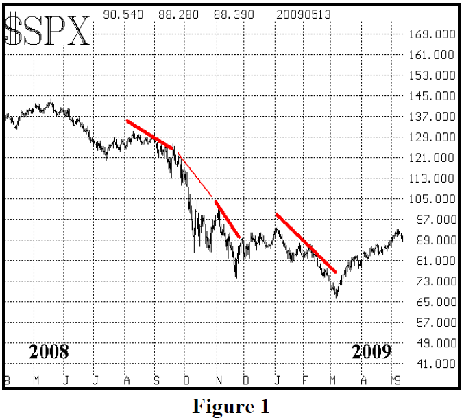
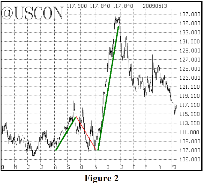
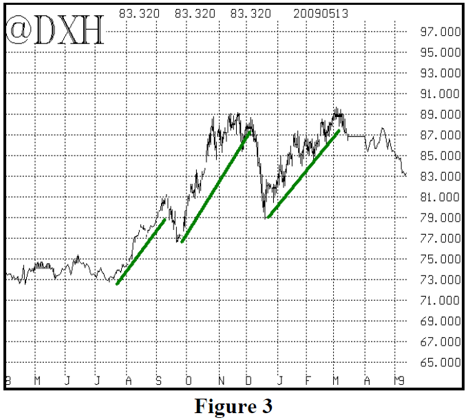
The Dollar’s negative correlation to stocks was stronger than Bond’s, as Bonds seemed to be influenced more by the pending passage of TARP and other stimulus measures at the time. The Yen (not shown) rallied strongly from August 2008 to January 2009.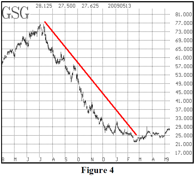
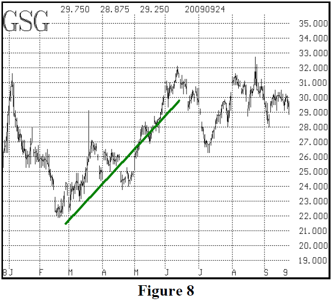
Figure 4 shows the iShares Goldman Sachs Commodity Index ETF (GSG) during the same time period. Obviously, commodities – a “risk” asset – were declining sharply during this same time period, as well.
Figures 1 through 4 also show that the period denoted by the trend lines was quite different, say, from the Summer of 2008 (the left side of each chart) when these markets weren’t very correlated at all. Note that, during the Summer of 2008, stocks were falling (Figure 1) while commodities were still rising (Figure 4), while the Dollar (Figure 3) and Bonds (Figure 2) were relatively flat. That is, during the summer of 2008, the general consensus didn’t recognize that such dire financial crises lay ahead, and thus there wasn’t such a flight to safety, even though the stock market was declining during that summer (2008).
The correlation of these assets doesn’t end there, though. Even as the stock market began to rally, in March 2009, the correlation persisted between these asset classes – it just reversed. From March 2009 through July 2009, “risk assets” were in demand while “risk-averse assets” were not. I suppose one could make an argument either way as to what that means. The positive viewpoint would be that investors think the crisis has passed, and thus are moving into risk assets again. The more negative interpretation, though, would be that these assets shouldn’t be so uniformly correlated in “normal” times – and therefore, by inference, this would describe a market rally in a financial crisis, rather than a true economic recovery.
Figures 5 through 8 show the activity of these same four markets during 2009. Copper also rallied strongly (not shown in a chart). The red trend lines are directly opposed to the green trend lines. Those opposite comparisons lasted from March to July (2009), but after that, there were some divergences.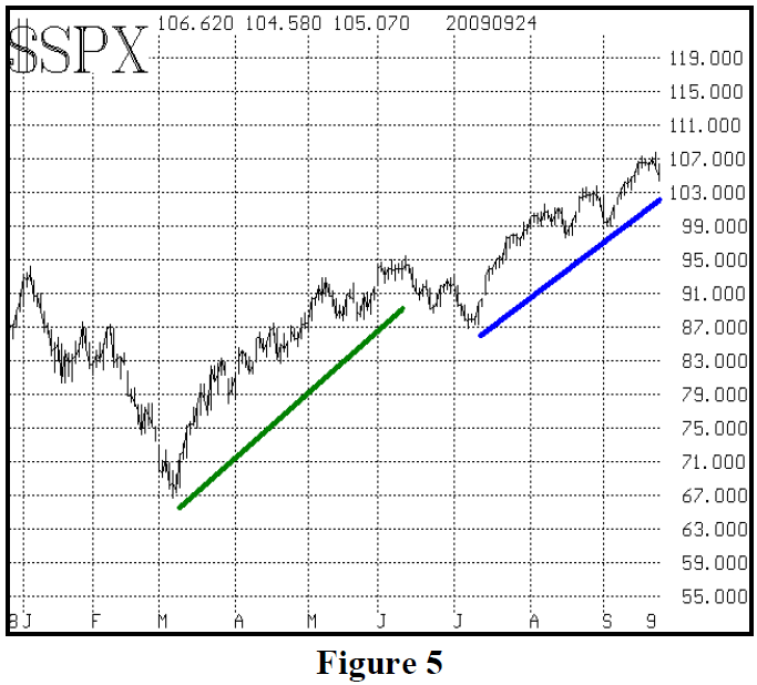
In my opinion, this makes sense in that from March to July, traders were still afraid of a “double dip,” or retest of the lows, however, you might want to state it. That is, they weren’t buying into the theory that the economy was going to be okay (at least, not so quickly).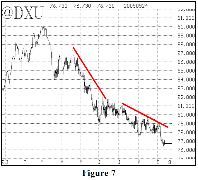
However, after the 9% July correction in the stock market and the subsequent strong rally back, it seems like a lot of investors then bought into the idea of an economic recovery. Under that backdrop, going into the late summer and fall of 2009, the asset classes began to trade divergently – in a pattern more in line with “normal” markets of the past. Notice that, after July, Bonds and commodities traded sideways, but there was still some negative correlation between $SPX and the Dollar. As the stock market continued to rally into April of 2010, there wasn’t much correlation. Things seemed to be “normal” in the historic sense, in that these asset classes were going about their business separately.
However, in recent months, as the European credit crises began to emerge and more and more negative news appeared, there was suddenly a return to the more negative environment where these asset classes were once again in negative correlation. This certainly implies that many investors felt that the economic recovery was not at hand and that things were not “normal.”
The activity of these asset classes hasn’t been as obviously in negative correlation as it was in the fall of 2008, say, but there are certainly some things that have caused investors to begin to worry again.
Stocks fell sharply from mid-April through the end of May, but have rallied back some in June. Commodities – as measured by the GSCI Index (GSG] and copper – have followed stocks: declining in May, but rebounding in June.
The Dollar was very strong in April and May (2010) when $SPX was falling, but at least the Dollar has backed off this month while $SPX rallied – as opposed to T-Bonds, which just kept going higher.
What has been particularly disconcerting for those who believe that economic problems are behind us, has been the strong T-Bond rally since early April. At first, that was to be expected, as “risk-averse” assets were in favor in April and May. But T-Bonds have continued to rally, even when the stock market rallied in June. That is a “divergence” that will soon have to be resolved. It certainly is fodder for those who say the stock market decline over the past few days is not just a minor pullback to a new bull phase, but is rather the beginning of the next major market decline.
Can there be a sustained rally in stocks if T-Bonds are predicting more economic malaise? Many economic experts and bearish traders think not.
Bonds are on the verge of making a new high. The chart below is that of the iShares Barclay’s 20+ Year Treasury ETF (symbol: TLT). This is the ETF that most closely tracks the trading of the T-Bond futures.
TLT closed yesterday at 99.24, a new closing high for the past eight months. If it closes above 100, it would be the highest close since April of 2009, and that would be a negative for stocks.
So we want to buy a TLT breakout over 100. Think of it as a hedge to bullish market positions, if you prefer.
     Position S591: TLT Conditional Call Buy
            IF TLT closes above 100,
         THEN Buy 8 TLT July 100 calls.
     TLT: 98.65          July 100 call: 0.79
 If bought, stop yourself out on a close below 98.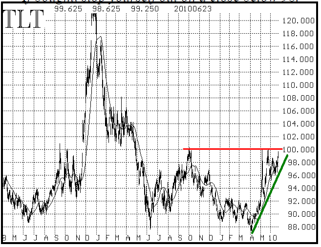
“Macro” Protection For Stock Portfolios
So, the first way that one might handle uncertainly is to keep a hedge in place in “risk-averse” assets. The purchase of TLT calls is one way to do that.
Another way, though, is to use broad-based options to protect a portfolio of stocks. We wrote about this subject in detail in Volume 16, Number 13 in July, 2007. We also produced an extensive white paper on the topic of Modern Portfolio Protection at that time, which we tried to market to institutional investors. Our premise was that protection was cheap, and with the market on a very non-volatile four-year run, it was time to take some defensive action for stock portfolios.
That was right near the top of the market, and – surprise! – no one was interested in our thoughts on using options to protect their stock portfolios. Within a month, “subprime debt” had become nearly a household word, and the beginnings of what became a major bear market and financial crisis had occurred.
Now, with the market having rallied 70% off its March 2009 bottom, we are re-visiting the subject – albeit in less detail this time.
There are several ways that an investor can hedge a large portfolio of stocks with derivatives, but there are really only two ways that make much sense. The entire spectrum of macro protection1 ranges from hedging with futures (not desirable in most cases, because all profit potential is cut off by the futures) to the simple purchase of a protective option.
Sometimes, simplest is best, and that is probably the case here. There are two approaches that one could take: either buy puts on $SPX or buy calls on $VIX. Either one of those would appreciate in value if the stock market were to take another major downward hit.
In my opinion, the purchase of $VIX calls is a much better, more dynamic way, to approach protection. That is because $VIX will explode whenever the market declines sharply, no matter where $SPX is. But if you buy $SPX puts today and then a large rally ensues before a large decline occurs, the striking price of your $SPX puts is likely to be so far out of the money as to do you no good during the declining phase.
We recently updated two studies regarding the cost of such protection. The first involved buying $SPX puts every three months, and rolling them without fail. There was no provision for taking profits or rolling during the three-month holding period – only at its end. The chart above shows the cost of such protective activity, assuming that the striking price of the $SPX puts being bought was always initially 10% out of the money. If you think of the put purchase as an insurance policy, then the difference between the current $SPX price and the striking price of the protective put can be considered your “deductible.” That is how far the market will decline before your protection “engages.”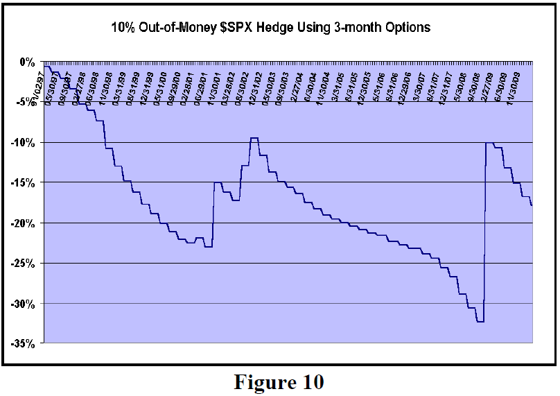
As you can see from Figure 10 above, in most quarters, one lost the put premium. However, during 2000-2001 there were some substantial profits earned by the hedge. Then again, in the last quarter of 2008, there were very heavy profits earned by the $SPX puts. Note that results could likely be improved by trading during the quarter – as would have certainly been the case in July and August 2007, when the market fell sharply, but then rallied back in September. In the theoretical scenario used above, those puts were actually sold at a loss because they were held all the way to September 2007 expiration.
In Figure 10, there are about 13 years covered in the study, and the total loss was about 18% of the portfolio value. Simplistically – without compounding – that’s an annual cost of 1.4% of net asset value to protect the portfolio with $SPX puts 10% out-of-the-money. That certainly seems pretty cheap to me. This period encompasses three large bull markets and two large bear markets, so it should be fairly representative of how things might play out in the future.
Note, we also looked at buying puts with longer expirations and with other “deductibles,” but the above construction seems to be better than nearly all the rest.
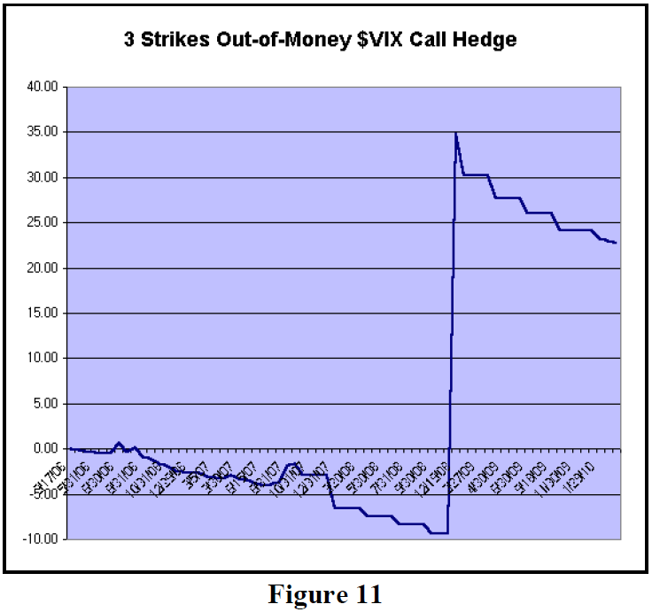
The other method of protection is to buy $VIX calls (also out of the money). $VIX options have only been trading since March 2006, so a similar study for buying $VIX calls can only extend back that far.
Figure 11 below shows the results of buying a 20% net asset value hedge using $VIX calls that are three strikes out of the money, expiring in three months. By “three strikes out of the money,” I mean a strike that is 7.5 points above the current $VIX futures price when the futures price is below 30, or a strike 15 points above the futures price when the futures price is above 30.
You can see that this hedge made a modest profit in the July-August 2007 period (referred to earlier), and then made massive profits in the 4th quarter of 2008. In fact, the profits from 2008 were so great that the hedging activity has produced a gain to date. One would not expect that to hold up over a longer time period (such as 13 years, as was the length of the $SPX study), but this is still a more viable approach to “macro” hedging.
It should be noted that – with either $SPX or $VIX – “collars” are also viable, although again that strategy is far better with $VIX options than with $SPX options. The collar in $VIX involves selling a put against the long call, and that put has limited exposure to the investor since $VIX really doesn’t go below 10 and obviously can’t go below zero. So, one’s stock portfolio would not have the “cap” on it that an $SPX collared short call would impose.
In summary, there is always uncertainty in the markets. There are times when it pays one to take protective activity, and this is certainly one of those times, in my opinion. So, whether you prefer to own some “riskaverse” assets or to use “macro protection” strategies, those with large portfolios to protect should be considering one or the other.
This article was originally published in The Option Strategist Newsletter Volume 19, No. 12 on June 25, 2010.

© 2023 The Option Strategist | McMillan Analysis Corporation