
By Lawrence G. McMillan
This article was originally published in The Option Strategist Newsletter Volume 9, No. 2 on January 27, 2000.
The question posed in the title above is one that should probably be asked more often than it is. Somehow, it has become something of a consensus in the option trading community that implied and historical (actual) volatility will converge. That’s not really true – at least not in the short term. Moreover, even if they do converge, which one was right to begin with – implied or historical? That is, did implied volatility move to get more in line with actual movements of the underlying, or did the stock’s movement speed up or slow down to get in line with implied volatility? In this article, we’ll look at some examples of what really happens with respect to implied and historical volatility, and we’ll try to draw some conclusions regarding this comparison.
As a brief review for newer subscribers, historical volatility is a measure of how fast the underlying has been changing in price in the past. It is also called actual volatility or statistical volatility. On the other hand, implied volatility is the volatility that is built into an option’s price; it is the option market’s “guess” at how volatile the underlying will be during the life of the option. Actual volatility is a well-defined mathematical quantity, but it can only be calculated after price movements have occurred. Implied volatility is a forward looking estimate, and since it is based on trader’s suppositions, it can be wrong – just as any estimate of future events can be in error.
A number of charts will be presented in this article, because visual aids can often describe the situation better. Let’s start out with the $OEX Index, because in the past we’ve discussed how its options are routinely overpriced. That is, implied volatility of $OEX options is almost always higher than what actual volatility turns out to be. This has been the subject of a couple of previous articles, one of which instigated some verbal sparring in Barron’s. Nevertheless, the fact remains that $OEX options are mostly overpriced. Consider the following chart: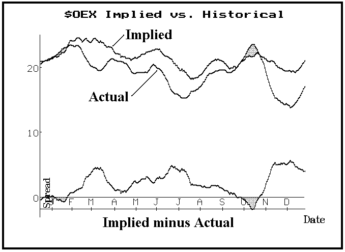
First, let’s define what the chart depicts. The three lines are: a) implied volatility, b) actual volatility, and c) the difference of the two. There is an important distinction here, though, as to what comprises these curves:
a) the implied volatility curve depicts the 20-day moving average of daily composite implied volatility readings for $OEX. That is, each day one number is computed as a composite implied volatility for $OEX for that day. It encompasses all the $OEX options, so it is different from $VIX. To smooth out those daily readings, a 20-day simple moving average is used.
b) the actual volatility on the graph is a little different from what one normally thinks of as historical volatility. It is the 20-day historical volatility, computed 20 days later than the date of the implied volatility calculation. Hence, points on the implied volatility curve are matched with a 20-day historical volatility calculation which was made 20 days later. Thus, the two curves more or less show the prediction of volatility and what actually happened over the 20 day period. These actual readings are smoothed as well, with a 20-day moving average.
c) the difference of the two is quite simple, and it is shown as the bottom curve on the graph. A “zero” line is drawn through the difference.
When this “difference line” passes through the zero line, the projection of volatility and what actually occurred were equal. If the “difference” line is above the zero line, then implied volatility was too high; the options were overpriced. Conversely, if the “difference line” is below the zero line, then actual volatility turned out to be greater than implied volatility had anticipated. The options were underpriced in that case. Those areas are shaded in both graphs. In essence, you would want to own options during the shaded periods on the chart, and would want to be a seller of options during the non-shaded areas.
Very few charts are as one-dimensional as the $OEX chart, where the options were so consistently overpriced. Most stocks find the “difference line” oscillating back and forth about the zero mark. Consider the following similar chart for Qualcomm (QCOM), with the stock chart printed below it.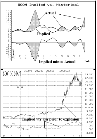
The volatility comparison chart shows several shaded areas – ones in which the stock was more volatile than the options had predicted. Owners of options profited during this time, provided they had a more or less neutral outlook on the stock. The bottom chart shows the stock’s performance in the March-April, 1999, period – the largest shaded area on the chart. Note how implied was quite low before the stock made the strong move from 10 to 30 (split-adjusted) in little more than a month.
Next, a “picture” of a stock on which we successfully own straddles is included – Advanced Radio Telecom (ARTT) (Position E170). In this case, the stock has recently begun to make a strong move, yet implied volatility (which was “too low” to begin with) continues to remain low. Hence, the last shaded area is small but is growing rapidly.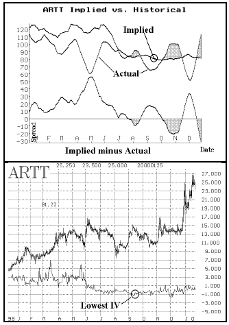
You can also tell something else important from the above charts. The implied volatility of the ARTT options was “too high” during the first half of 1999. Thus, the “difference line” remains above the zero mark for an extended period of time on the top chart, above. The same thing can be seen on the lower chart, which shows that implied volatility was at its highest levels then.
The important things to note from these charts are that they clearly show that implied volatility is really not a very good predictor of the actual volatility that is to follow. If it were, the “difference line” would hover near zero most of the time. Instead, it swings back and forth wildly – with implied volatility over- or under-estimating actual volatility by quite wide levels.
This means that using the difference between implied volatility and current historical volatility as a criterion for deciding whether to buy volatility or to sell it is incorrect, and possibly dangerous to your wealth. That is, if you happen to notice that XYZ’s options have an implied volatility of 30% and XYZ is currently trading with a 20-day historical volatility of 20%, you can’t draw much of a conclusion about whether to buy or sell volatility from this information. It is irrelevant.
One is far better served by comparing “apples to apples” as it were. In other words, compare implied volatility to past levels of implied volatility. Consider the top chart of ARTT above. The word “implied” points to a circle on the implied volatility line on the graph. If you compare it with past levels of implied volatility, you will see that it is the lowest point of implied volatility on the chart. The similar point is marked on lower chart on the left, as well. It was at that low point of implied volatility – as compared to past levels of implied, not to historical volatility – that the ARTT straddles were recommended.
One thing that does stand out on these charts is that implied volatility seems to fluctuate less than actual volatility. That, I believe, is a natural function of the predictive process. We have mentioned similar observations in the past: for example, when the market collapses, implied volatilities of LEAPS options only rise modestly – reacting less than short-term volatilities. In other words, option traders and market makers are predicting volatility when they price options, and one tends to make a prediction that is somewhat “middle of the road”, for an extreme prediction is more likely to be wrong. Of course, it turns out to be wrong anyway, since actual volatility jumps around quite rapidly.
While these charts are an interesting novelty, I don’t think one can use them for any predictive value. In that light, consider one more chart. This one is of Timken Company (TKR). These options are quite cheap and the straddles are an excellent buy -- the best one statistically on the day of this analysis (1/25/2000). Moreover, actual volatility has begun to increase already, so that the chart below shows a rather lengthy shadow area already having been formed. One would think, if these charts had predictive value, that one would want to enter the position just before the shaded area developed (as in the ARTT chart). But since this straddle buy has such excellent probability statistics, one can feel confident that it’s a good buy, despite the fact that the shaded area is already some weeks old.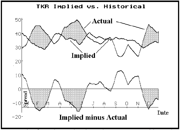
The few charts that have been presented here don’t constitute a rigorous study upon which to draw the conclusion that implied is a poor predictor of actual volatility, but it is my firm opinion that that statement is true. Some graduate student somewhere, looking for a master’s thesis topic, could take it from here.
This article was originally published in The Option Strategist Newsletter Volume 9, No. 2 on January 27, 2000.

© 2023 The Option Strategist | McMillan Analysis Corporation