
By Lawrence G. McMillan
This article was originally published in The Option Strategist Newsletter Volume 21, No. 15 on August 10, 2012.
In a continuation of the irregular series, explaining our analytical techniques, we are going to discuss how we interpret put-call ratio charts. This series began two issues ago with an article on naked put selling. Future articles in this series will encompass other aspects of position selection: calendar spreads, volatility skew-based trades, ratio spreads, and so forth.
In order to adequately understand how to interpret a put-call ratio chart, a certain amount of background information will be useful, including not only how the data is gathered and computed, but also how one can utilize the computer programs that we have designed to help in interpreting these charts.
Calculating the put-call ratio
A put-call ratio can be computed for any entity: individual stocks or ETFs, all stocks (called the “equity-only” putcall ratio), everything except futures options (called the “total” put-call ratio), and futures (computed across all futures contracts expiring in various months on the same underlying entity).
The “standard” ratio (also called basic, or elementary in some texts) involves using option volume only. For example, suppose we are considering IBM options. At the end of the day, we sum up the volume on all of the various put options; separately, we sum the volume on all of the various call options:
Standard ratio = put volume/call volume
A moving average must be kept, for the daily ratios can be a volatile series of data. We use the 21-day ratio on all of our charts, because we like to treat this as an intermediateterm indicator, and the 21-day average usually gives about 6 to 8 signals per year per underlying entity.
The “weighted” ratio is a bit more complicated to calculate and, as such, normally requires a computer. In this case, we first calculate the dollar volume for each individual option traded that day. Again, suppose we are looking at IBM. Then, at day’s end, for each individual put and/or call we would calculate:
Dollar volume = option volume x option price
This gives us the number of dollars that were spent on that option. We use the closing price (average of bid and asked), but if one really wants to burn the computer firepower, he could calculate this for each trade all day long – a tedious process that in my opinion isn’t necessary in order to obtain the intermediate-term signals.
Then to compute the weighted ratio, one sums the dollar volume of all the puts traded that day, divided by the dollar volume of all the calls traded that day.
Weighted ratio = put dollar volume/call dollar volume
In short, the standard ratio only measures the volume of put options versus the volume of call options, while the weighted ratio measures the dollars being spent on puts versus the dollars being spent on calls. The latter is a more accurate measure in most cases.
We compute ratios daily on a) all stocks and ETFs that average at least 7,500 options contracts traded daily, b) a set of 70 stocks, whether they are included in “a” or not, and c) weighted ratios of 116 stocks and ETFs. The charts of all of these are posted daily on The Strategy Zone.
It is difficult to gather this data yourself without subscribing to a service that records all option data. The CBOE publishes data of the activity on its exchange alone, and that is readily available to subscribers.
Put-Call Ratio Signals
Since these are contrary indicators, a buy signal is generated when “too many” people are buying puts; a sell signal is issued when “too many” people are buying calls. We define “too many” as local maxima and minima on the put-call ratio charts.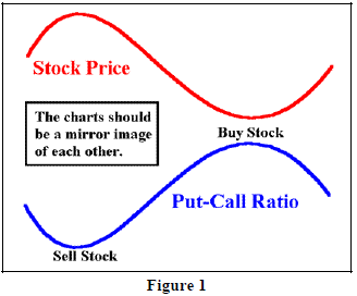
Figure 1 shows how this works, in theory. A theoretical stock price is represented by the red line; a put-call ratio on that stock is represented by the blue line. Ideally, there is an inverse relationship between the two. When the stock is falling, traders are buying puts, and so the put-call ratio is rising. Then, when the put-call ratio tops out, the stock reaches a bottom. That peak in the put-call ratio is when “too many” puts have been bought, and that is the buy signal for the stock (marked as “buy stock” in Figure 1). Conversely, when the stock rises, the put-call ratio falls. When the put-call ratio makes a low and begins to rise, that is “too much” call buying which is a sell signal for the stock (marked as “Sell stock” in Figure 1).
On an actual put-call ratio chart, the symmetry is rarely as smooth as that shown in Figure 1. Rather, it is likely to be more like that in Figure 2. In Figure 2, the upper line is that unscaled chart of $SPX, while the lower line is the weighted equity-only put-call ratio. There are no buy and sell signals marked on Figure 2, because its purpose is merely to convey the concept that in a useful put-call ratio chart, the inverse relationship between the 21-day moving average and the underlying price is evident. In cases where there is not such symmetry, it usually indicates that there is hedging or some other nonspeculative option activity taking place. In those nonsymmetric cases, the put-call ratio signals cannot be used. For example, if the ratio is rising and the underlying price is rising, that means that put volume is increasing while the underlying price is going up. That’s illogical and is probably a sign that traders are buying the stock and buying puts for protection. In any case, contrary signals are based on speculative activity, in theory, and so without the symmetry, the activity is not speculative.
Figure 3 below is the same chart as Figure 2, except now the buy and sell signals are marked on the chart. Those signals are placed at local maxima and minima on the put-call ratio chart. You can see that they were all pretty good signals – preceding an intermediateterm rally or decline in the stock price.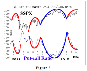
It should be noted that this method is dynamic – and thus the correct method of interpreting charts. We don’t necessarily care what the level of the put-call ratio is when it rolls over. It is the change of trend from put buying dominance to call buying dominance (or vice versa) that is important. A static approach would be to use a fixed level of the put call ratio as a buy signal. This approach is wrong and will eventually result in a large loss when market trends change. The dynamic approach is the only correct one.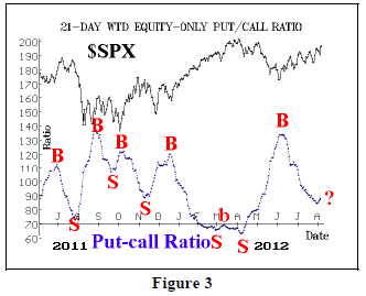
Buy and sell signals are marked on the chart (we’ll address the question mark shortly), but one might rightfully ask if the signals can be so accurately placed in real time. We use a proprietary computer program to aid in determining where local maxima and minima might occur, without having to wait for the chart to visibly roll over. Without going into a lot of detail, let me describe how this program works. The computer knows the numbers that will be coming off the 21-day moving average. Moreover, it has a general idea of the numbers that will be coming onto the average – i.e., it know the daily put-call ratios for the last few days and it also knows the average daily put-call ratios throughout history. So the program can make the assumption that the daily numbers that will coming onto the average over the next few days are a blend of what has happened in the past. With this information, a probability tree can be built – something like a Chess-playing program does.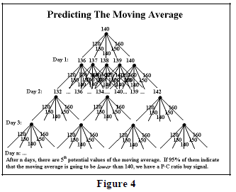
Figure 4 shows such a tree. In Figure 4, the top of the tree is the number 140; that is the current 21-day moving average of the put-call ratio. Emanating from that are five branches on the tree – 120, 130, 140, 150, and 160. This is just an example of the daily put-call ratio numbers that the computer estimates will be coming onto the average. This results in five possible outcomes after the first day. From each of those, five more branches emanate, and so forth. If the tree extends downward for n days, there will be 5n branches at the bottom of the tree. It is a simple matter, then, to count them up and see how many result in a lower average than 140 – the current 21-day moving average. If more than 95% result in a lower average, then we can predict that the current average (140) is going to be a local maxima – i.e., a buy signal – with 95% certainty.
In reality, the computer is capable of handling far more than 5 branches on each node of the tree. However, there is always the chance that a truly outlying number will be generated in real life that was not part of the computer analysis. Even so, this is a viable way of identifying turning points in real time, without having to wait for the actual peak or trough to form on the put-call ratio chart. This method can also keep one from making a mistake and “calling” a signal too early.
That exact situation arose this week. Both the standard and weighted charts of the equity-only put-call ratios moved up for three straight days while the stock market declined. This occurred on August 1st through the 3rd. You can see this upward “wiggle” in Figure 3, for the weighted chart. It is marked with a question mark. To the naked eye, it looks like the ratio has begun to rise, which would mean that a sell signal is in place. However, the naked eye can be misled because it doesn’t know what numbers are coming off the moving average. In this case, the computer program was telling us that there was less than a 10% chance that a sell signal was occurring. Since we require 95%, it wasn’t even close. And, in fact, over the next three days, the ratio fell sharply and made new lows (see chart, page 6).
The output of this computer analysis is made available every day to subscribers to The Strategy Zone, the subscriber area of our web site. It is posted as a file on the same page where the put-call ratio charts are found. So each day it will say, for example, “IBM...NOW ON A BUY.” As long as the put-call ratio of IBM is falling, that same daily message will be displayed. But when the computer detects that IBM’s put-call ratio has bottomed and is beginning to rise, the computer’s output will be “IBM...NOW ON A SELL....CHANGED FROM BUY.” That message appears on the day that the computer program identifies the probability of the put-call ratio rolling over at a 95% chance or higher.
Identifying Put-Call Ratio Signals
In each issue and Hotline of this newsletter, we identify the stocks, ETFs, and futures whose signals have changed since the last publication date. We often make recommendations based on these ratios, as we also do in the Daily Strategist Newsletter. The two charts below are examples of overbought and oversold. Ideally, in these cases, the put-call ratio is streaking straight up or down and is at an extreme level.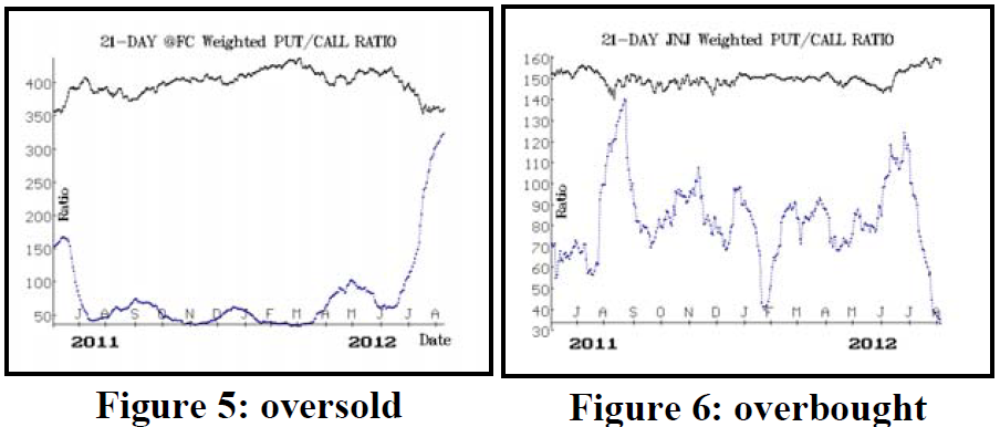
Figure 5 is the current chart of Feeder Cattle. The putcall ratio is racing higher as put buyers run amok, but the ratio hasn’t rolled over yet; that is “oversold.” Figure 6 is the chart of JNJ a few days ago. The JNJ put-call ratio was plunging to extreme lows as call buyers dominated the scene, but the ratio hadn’t rolled over as of the date on this chart; hence it was “overbought.”
Let’s look at a couple of charts to see how they might be interpreted. The first is the standard put-call ratio of General Dynamics (GD). Technically, there is a buy signal here because of the peak marked on the righthand side of the chart. But this chart is a mess. First, dividend arbitrage is evident. Note the two sharp moves pointed to by the blue arrows. The first is a huge drop in the ratio due to huge call volume when dividend arbitrage was established. 21 days later, there is a sharp rise when that number was removed from the average. Successful signals are marked in red; unsuccessful ones are marked in light blue. It’s pretty obvious that there are a lot of poor signals from this chart. Also, there isn’t the inverse symmetry that we look for. Hence, we would not take this latest buy signal.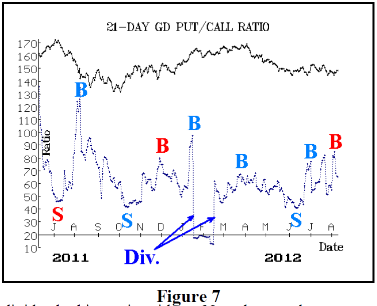
Figure 8 shows a much more attractive chart – the weighted chart of CME Group (CME). First of all, there is a general inverse symmetry here. Second, most of the signals – especially the recent ones – have been successful. Thus, I would be much more inclined to take this new buy signal that has just occurred.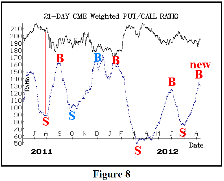
Finally, I require that the underlying entity be in a favorable technical position. For example, CME’s stock price is now breaking its downtrend line. That is helpful. I won’t buy a stock that is in a severe downtrend, even if a put-call ratio buy signal occurs. I would wait for some stabilization (higher high, higher low) in the stock price chart before entering.
This article was originally published in The Option Strategist Newsletter Volume 21, No. 15 on August 10, 2012.

© 2023 The Option Strategist | McMillan Analysis Corporation