By Lawrence G. McMillan
This article was originally published in The Option Strategist Newsletter Volume 9, No. 7 on April 13, 2000.
The CBOE’s Volatility Index ($VIX) has been a stalwart for option traders and technicians since it was introduced in the early 1990's. The $VIX measures the implied volatility of $OEX options. However, in recent months, the trading in $OEX options has slowed dramatically, and many traders have forsaken them for the more active and volatile equity options – especially NASDAQ options. As a result, $VIX is becoming harder to interpret. Therefore, we thought that perhaps another Volatility Index could be constructed as a useful supplement to $VIX. It would be a “supplement” rather than a “replacement” because there may come a day when most speculators return to the $OEX market. If that were to happen, then $VIX would regain its former place as a premier measure of public sentiment.
Simplistically, $VIX measures the composite implied volatility of the $OEX Index options by taking a weighted average of the implied volatilities of eight OEX calls and puts, which have an average time to maturity of 30 days. It is useful mostly as a contrarian indicator – for it shows when the public is overcome with fear and panic (when $VIX is trading at extremely high levels) or when the public is too complacent (when $VIX is trading at extremely low levels). Traders who are contrarians – and that includes us – find $VIX a useful guide in determining when to buy the market (when $VIX has spiked up to dramatic heights and fallen back) or when to buy straddles (when $VIX is at extremely low levels).
As any contrarian trader knows, an indicator being used to measure sentiment should ideally be dominated by uninformed, public speculators – for they are the traders whose opinion is typically wrong at major turning points. Any market will have its share of hedgers, arbitrageurs, and institutional traders. Those traders are generally not useful for measuring sentiment, for their activities are either of a hedging nature or at least they are less emotional. So, the best contrary indicators are replete with public, speculative trading volume and less influenced by professional activity. $OEX trading activity used to be heavily influenced by the retail public, but in recent months and years, the typical retail trader has moved to stock options or to QQQ “stock” and – to a lesser extent – to the lower-priced QQQ options or Dow-Jones ($DJX) options. QQQ, by the way, is the NASDAQ-100 “tracking stock” that trades on the AMEX. QQQ itself trades in excess of 30 million shares on many days, and in excess of 20 million shares on most days. This routinely makes it one of the most active stocks in the U.S. and, hence, the world!
So, since speculators have gone into stock options, we have attempted to construct two new premium indices that measure the sentiment of the option market – 1) a more representative premium index of stock options, using the individual stock options of the stocks that compose the S&P 100 Index ($OEX), and 2) a composite implied volatility of QQQ options.
Using the Individual $OEX Stocks
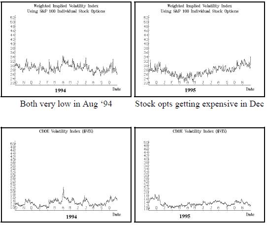
The first of these two measures was constructed by using the daily composite implied volatility of each of the 100 stocks that currently make up the $OEX Index itself. That is, each day we compute a composite implied volatility for each stock, weighting its options by trading volume and distance in- or out-ofthe- money (at-the-money gets the highest weighting). Then we took those individual implieds and averaged them for each trading day. The result was a new index – which we’ll call the “100 Stocks" implied volatility. Note that this is not the same as the $OEX implied volatility, which can be computed by using our weighting composite for all $OEX options on any given trading day. That sort of $OEX composite volatility is similar to $VIX, but not exactly the same.
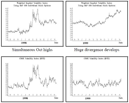
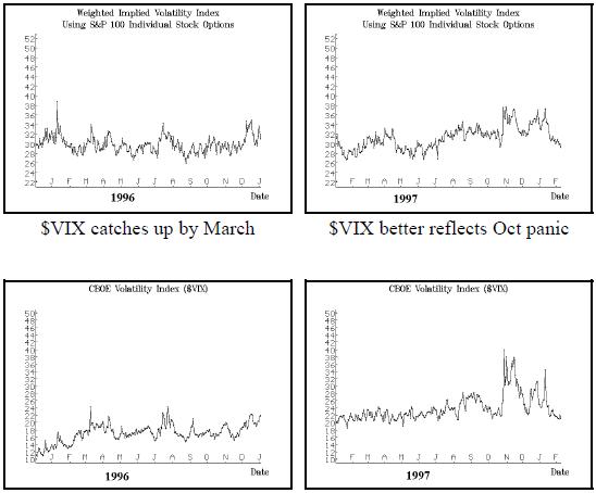
The graphs shown on this and the previous page encompass nearly a sixyear history of this new implied volatility measure (the top row of graphs in each case) positioned above the traditional $VIX measurement. The scaling is tall enough to allow one to view the entire set of graphs, from left to right, as if it were one continuous chart. In that way, one can see that the new “100 Stocks” graph and that of the $VIX had pretty much the same shape until late 1999. Oh, sure, there were some divergences, but in general they made their lows and highs (Oct ‘97 and Oct’98) at about the same time. Note that the fact that the new “100 stocks" volatility is routinely a higher number than $VIX is to be expected – it reflects the fact that the volatility of an individual stock (and hence an average of the same) is higher than the volatility of an index of those same stocks. Indices are always less volatile than their individual components.
However, a wide divergence in implied volatility has developed over the last several months – particularly since November of 1999. I think most option traders rightfully feel that options are more expensive now on a daily basis than they’ve ever been (with the possible exception of market crashes and panics and perhaps the few days after those traumatic events). This current expensiveness of options relates, of course, to the fact that the underlying markets are more volatile. Our new “100 stocks” premium index has accordingly been rising steadily since the fall of 1999.
However, $OEX options have not reflected these facts. In the last issue of the Option Strategist we showed a graph which demonstrated that the statistical volatility of the $OEX Index itself had risen, but the implied volatility of $OEX options had not. The rightmost graphs on this page depict the same effect, only using implied volatility of the 100 stocks and contrasting it with $VIX. The individual options of these 100 stocks have gotten more expensive (top chart on right), but $VIX – for some reason – has remained flat (bottom chart on right). $VIX has lost touch with reality. Why has this happened? Probably because $VIX has become dominated by institutional traders since the public has moved to other venues, and institutional traders tend to be less emotional – although in this case I’d say they are being somewhat foolish by keeping the implied volatility so low. You can’t blame this on the market makers – they only position the markets to balance the effects of supply and demand, and this is where “supply” is saying that the $OEX option markets should be
QQQ Composite Implied Volatilty
Another indicator of implied volatility that we thought was important to look at as an alternative to $VIX is that of the QQQ Index. In this case, we are using all of the QQQ options to compute this composite implied volatility – weighting each of them as described earlier, by volume and distance from the stock price.
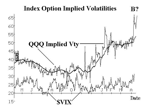
The composite volatility chart of QQQ is shown on the right, overlaid on the same graph with $VIX during that time. QQQ was first introduced on March 10, 1999 (so it recently celebrated its first birthday – without much fanfare, I might add). Since QQQ has only existed for a short time, we can’t compare it with $VIX for as long of a time as we could with the “100 Stocks” index created above. The 20-day moving average of QQQ implied volatility is also shown on the chart, to enable one to see the trend.
However, even one year’s comparison between QQQ and $VIX is enlightening. You can see that QQQ implied volatility began increasing in earnest last December – at about the same time that NASDAQ began that terrific year-end push during the last half of December. Then QQQ implied volatility spiked higher a couple of times during January – reflecting the sharp, short-term correction that occurred in that market at that time. Since then it has maintained its high levels, inching higher in later March, and then spiking to all-time highs as the NASDAQ market took a beating, culminating with the peak in implied volatility simultaneous with the panic V-bottom on April 4th. While all this was going on, $VIX was more or less sideways, although it did spike up a little in early April.
Again, it seems that this QQQ composite implied volatility is more reflective of real world option premiums than is $VIX. Now, as a general rule of thumb, we don’t particularly care where premium levels are at any given time, except for one purpose – to use them as a contrary indicator for market prediction purposes.
There are some observers of $VIX who can interpret the fairly minute wiggles that it is making these days, and make sense of them. However, it is a lot easier to use an index that clearly shows the extremes than to have to try to interpret the “tea leaves” that $VIX is giving us. Note that there are still some speculators trading $OEX options, so $VIX still has some predictive ability (e.g., its small spike high on April 4th).
However, the spike high on the QQQ chart is readily observable, and so is the fact that it is the highest reading on the chart – perhaps being something akin to what $VIX and the “100 stocks” registered back in September and October of 1999. That’s why the last chart on the previous page is marked with “B?” at that spike.
If the QQQ is truly a reliable guide in terms of market sentiment, then that spike peak should indicate that the “average” trader was panicking and hence that should mark the bottom for QQQ (and for NASDAQ as a whole). There are a couple of problems with that argument, though: 1) it is known that QQQ options are heavily traded by institutions (witness the fact that the QQQ put-call ratio had recently reached levels of 7-to-1 – before this recent selloff) and 2) we don’t have a long track record of how QQQ premium spikes relate to behavior in the underlying.
Nevertheless, it is certainly worth noting that QQQ option premiums spiked like that – a bullish development. One should also note, however, that back in 1998, it took a “retest” of both prices and premium levels by the broad market before the ensuing bull market took hold. A similar scenario might have to play out now in NASDAQ – perhaps a retest of the lows (88 on QQQ or 3525 on $NDX). Generally, at the time of that retest, it is most bullish if prices actually make a slightly lower low, but indicators don’t quite reach the same extremes that they did on the first low. That would then constitute a positive divergence. Now, with QQQ at 92 and $NDX at 3700 as of this writing, we are approaching the retest of the bottom ($OEX and $SPX, however, are well above their lows of April 4th, so far).
Summary
There are further refinements that can be tried in order to generate alternatives to $VIX. They might include using an unweighted QQQ composite, or using a subset of QQQ options rather than weighting all of them, or using a different set of stocks than those which comprise $OEX or QQQ. In any case, though, it appears that these alternative premium indices are more capable of reflecting current market conditions than is $VIX. We will continue to monitor these “new” measures and to try new ones. Meanwhile, $VIX still has potential to be valuable, and we certainly wouldn’t recommend discarding it, but for now it’s singing the wrong tune.
This article was originally published in The Option Strategist Newsletter Volume 9, No. 7 on April 13, 2000.
© 2023 The Option Strategist | McMillan Analysis Corporation